We often talk about how label and packaging design can attract customers, but there is another element that consumers are paying just as much attention to: the information on your labels. With more and more people carrying smartphones, in-depth information is little more than a swipe/touch away. But, even though a wealth of information is literally at their fingertips, searching for more information (either in the store aisles or later at home) can possibly delay or stop them from purchasing your product. Let’s discuss some examples of the types of information consumers look for and how you can include them on your label, all without overwhelming the design.
Product Label Information and Purchase Decisions
In an online study* of 2,000 U.S. adult shoppers, researchers found that the vast majority of shoppers relied heavily on product package information to make a purchase decision. Here are some key highlights of their study:
- 85% of shoppers said their purchase decisions are informed by reading a product package while shopping.
- 75% said if they can’t find the product information they need while in the store, they’re more likely to wait, then research and purchase the product online.
- 65% of shoppers indicated that they spend less than one minute using their smartphones to research products in the grocery store before making purchase decisions.
Having information readily available on your product label is a smart move to ensure customers find an answer to their questions and put your product in the cart rather than back on the shelf. Or worse, they put your product back and find the information they’re looking for on a competitor’s product label. While it may not be possible to provide all the information consumers might be looking for, there are ways you can help your customers find the information they seek with the right labeling strategy.
Give Customers What They Want
Depending on your market, certain types of information will be more important to consumers than others. For example, food and beverage products are typically required to have a nutrition facts table, but over the last few years other information has been popping up on labels (e.g. where the ingredients came from, the production process, whether the product is organic or free of GMOs, gluten, dairy, etc.). Whatever product you sell, there are different elements that make your labels helpful to customers as they make a purchase decision.
Research your market
Before you rush to design and order your labels, be sure that you are aware of all the government regulations, consumer trends, and competitors that affect your day-to-day business. You can find out a lot of this information on the internet, but learning what your customers care about can be a little more tricky. Here are some ideas on how to get that information:
- Be straightforward. Ask customers about what’s important to them.
- Conduct an online survey. How well does your product label answer their questions?
- Test different label designs with a focus group to see which one works best.
After gathering and analyzing your data, it should be easier to decide what information to include on your product label, and then you can determine how it should be formatted See our tips on that below.
Make it easy to read
Information alone is great, but it won’t do your customers much good if they have a hard time reading it! Working with a professional label designer is a safe way to ensure your labels are easy to read, but we have some design tips if you choose the DIY route.
- Font style, size, and color: While script fonts may look pretty, they can be hard to read – especially if the text is small. We recommend using serif or san serif fonts for large bodies of text or smaller print. Speaking of size, keep your text around 10pt to make it easier to read. Lastly, use contrasting colors for your text and background (i.e. dark and light colors like black/white or navy blue/yellow) so the text can stand out.
- Blank space and bullet points: If you have a lot of information, bullet points can provide structure making the information easier to scan. Another way to make text scannable is by balancing blank space with artwork and text. It’s important to use blank space wisely because if the label has too much of it, then the information can be hard to notice. Of course, if it has too little, the label can look cluttered and distract customers. Use good judgment here to avoid being passed over on the shelf.
Squeezing product information onto a label can be challenging, and maybe even impossible for smaller products where the label isn’t very big. No need to stress about it. You can still give customers the information they want by providing online resources they can look up right there in the store aisle.
Connect with consumers online (and offline)
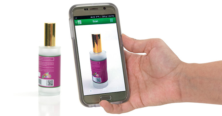
An easy way to provide more information is by listing a website URL (the shorter, the better) or adding a QR code consumers can scan to open a website, video, FAQ page, reviews, etc. Make sure that whatever content you share with consumers, it’s relevant and helpful. Websites and QR codes that open generic, promotional content can frustrate potential customers since they can’t find an answer. Not all consumers are tech-savvy, however, so it might be a good idea to add a customer service phone number to your label (if you have one) for their convenience.
Whatever product you sell, consumers want to know how yours is different from other brands. Having decision-making information right there on the label is a great way to answer questions and help them feel more confident about buying your product. Check out these articles on consumer and labeling trends to learn more about what consumers look for and want from a product label.
*Study commissioned by Digimarc and conducted by Harris Poll


